What is User Center Design?
The number of digital products is increasing. In two decades, many of them died, some of them survived, and there are many new comers. The digital product landscape is evolving in a lightning speed. UX design is a key component in the digital product creation. Its best practices are evolving too. We all know we need to embrace the change, instead of avoiding them.
So, in this post, we're going to dive in the no.1 principal in UX design - User Centered Design - and followed by a case study of a leading female magazine at Hong Kong.
The first UX post we learned that UX design is a scientific process that we can follow through to help us create products that will delight our users.
User Center Design is the backbone of this process.
Material
Don't Make Me Think - by Steve Krug
Before our products can arrive to the “Delightful” stage, the product must first be usable. In the UX world, we use the word Usability when we are referring to how easy it is to use a product. A product with low usability means that the product is difficult to use, and vice versa.
The bolded words are the guiding principles in User Center Design.
“Don’t make the user think” is the core of User Centered Design. We design the digital product in accordance of the users’ original behavior, so that they can have a mindless choice in using it. We don’t try to change their behavior and the inclination of how they use a product. We take the users’ needs into account at every stage of the product life cycle.
We want the user to find a product useful, usable and delightful.
Designing a digital product is a lot like writing a non-fiction book. We want the readers to absorb the knowledge we are trying to pass on them. Their takeaways are the keys. The reading process is just a mean to the end. But we want the process delightful. We don’t want to make the readers think about how to use the book. Maybe we have an unconventional approach for the structure of the book. We might even add a chapter as “How to use the book”.
After we structure how the forest looks like as a book, we take care of every single chapter as a tree and every single word as a leaf. We want them to touch the tree and breathe the fresh air releasing from the leaf. We want the artificial forest as natural as a real one. We will design the chapters in their language and write the words in their wordings. But we don’t know what we don’t know. We can’t pretend we’re the readers. The only way to figure out what they are familiar with is through - testing.
That’s the reason why the concept of prototype comes in the field of digital product implementation. We want to test the prototype as early as possible. If we could spot the fatal mistakes in the UX design as early as possible, we will reap two kinds of benefits: the user will have a product that they can easily use and we don’t have to invest in unnecessary implementation which will cost us humongous time and money.
In order to achieve all these amazing feeling for the users, we don’t want them to think about how they use the product. We want them to interact with the product with intuitive actions. We are not allowed to second guess the users’ intuitive actions. Every web user is different. There is no concept of an average web user. Everyone is unique.
Web users scan our websites, look for the first reasonable option, and muddle through along the way. In other words, they don’t read every single text on every single page, they won’t find the most optimal option among all the options for their solutions and they don’t read the instruction of how to use the site. Therefore, we need to design our websites to become self-evident, obvious and self-explanatory.
Now, we understand the web users tend to do exactly opposite of what we think. Based on the core of User Centered Design, we shouldn’t change their intuitive actions - scanning - which how they interact with a digital product. We embrace our users and build a billboard for them.
As a website, what are the components of a good billboard?
- Have a clear visual hierarchy
- Follow web architecture conventions
- Break up pages into clearly define areas
- Make it obvious what’s clickable
- Keep the noise down to a dull roar
Last but not least, there is always a rule of thumb in writing books, so is designing a good website, which is: every single word earns its place in the book. In other words, omitting needless words in the website. Cut the bullshit and get right to the point. Kill the instructions. Kill the happy talk. Kill the big words.
Things We Need To Get Right
With all the guiding principles, a big puzzle in the website construction and UX design is: navigation.
The navigation is a handle we can see and use in every step of using the site.
- It gives us something to hold onto
- It tells us what’s here
- It tells us how to use the site
The users’ psychologies behind a good navigation are simple. Browsing a website is like running an errand in a mall.
- We’re usually trying to find something
- We decide whether to ask first or browse first
The only difference is we don’t have a physical sense of where it is and where we are. But the rest of the user experiences are exactly the same:
- We have no sense of scale of the websites
- We have no sense of direction of the websites
- We have no sense of location of the websites
As a UX Designer, we need to follow the web architecture conventions to design a navigation. They are evolving and changing. But for the moment these are the basic components.
- Site ID
- Sections
- Utilities
- Subsections
- “You’re Here” indicator
- Page name
- Local navigation
- A way to search
- Breadcrumbs
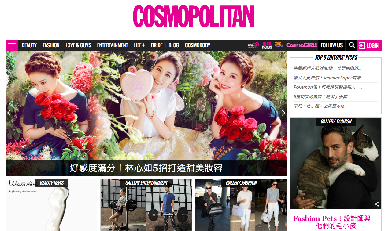
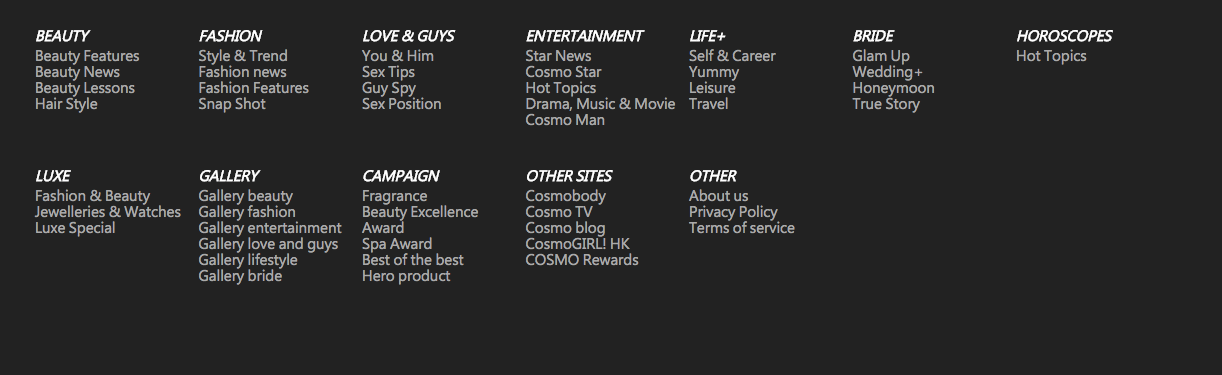
Let’s analysis the website I’m currently contributing to at South China Morning Post.
Cosmopolitan - a leading female magainze in Hong Kong
Site ID
Sections

“You’re Here” indicator and also the page name (by appearing in different color)

Utilities / a way to search

Breadcrumbs / another “You’re Here” indicator
Local Navigation
Looks like common sense, huh?
I’ve tested the website with many friends and they don’t find it difficult to use. This is exactly what you need in your navigation. (Remarks: I am not the UX Designer for the website. I am an Analyst Programmer at South China Morning Post.)
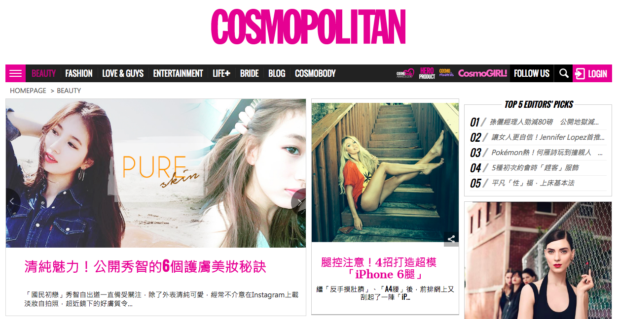
Nailing down the navigation first is like sketching the bare minimal of our websites. We have a scaffold built based on the site’s utilities and usabilities. The next step is to design the homepage that delivers our content to our audience in the guiding principles:
- Have a clear visual hierarchy
- Follow web architecture conventions
- Break up related contents into clearly define areas
- Make it obvious what’s clickable
- Keep the noise down to a dull roar
- Omit the needless words
The homepage is the entrance and the first impression of our websites. On top of the principals, this is the two things the homepage has to accommodate: site identity and mission.
Kill the happy talk. Kill the big words. Kill the mission statement. Getting the message of the site identities and missions across, we can start off with a good tagline. The welcome blurb will only come if the tagline isn’t good enough to do the the job. Sometimes, a well established brand is doing so well offline, so that they don’t even need a tagline.
Look again the http://www.cosmopolitan.com.hk/.

Do you find any difficulty to know what the site identity and mission are? I don’t think so.
Once again, “Don’t make the user think”.